
Photography by Elliot Swift.
Nicole Pellow
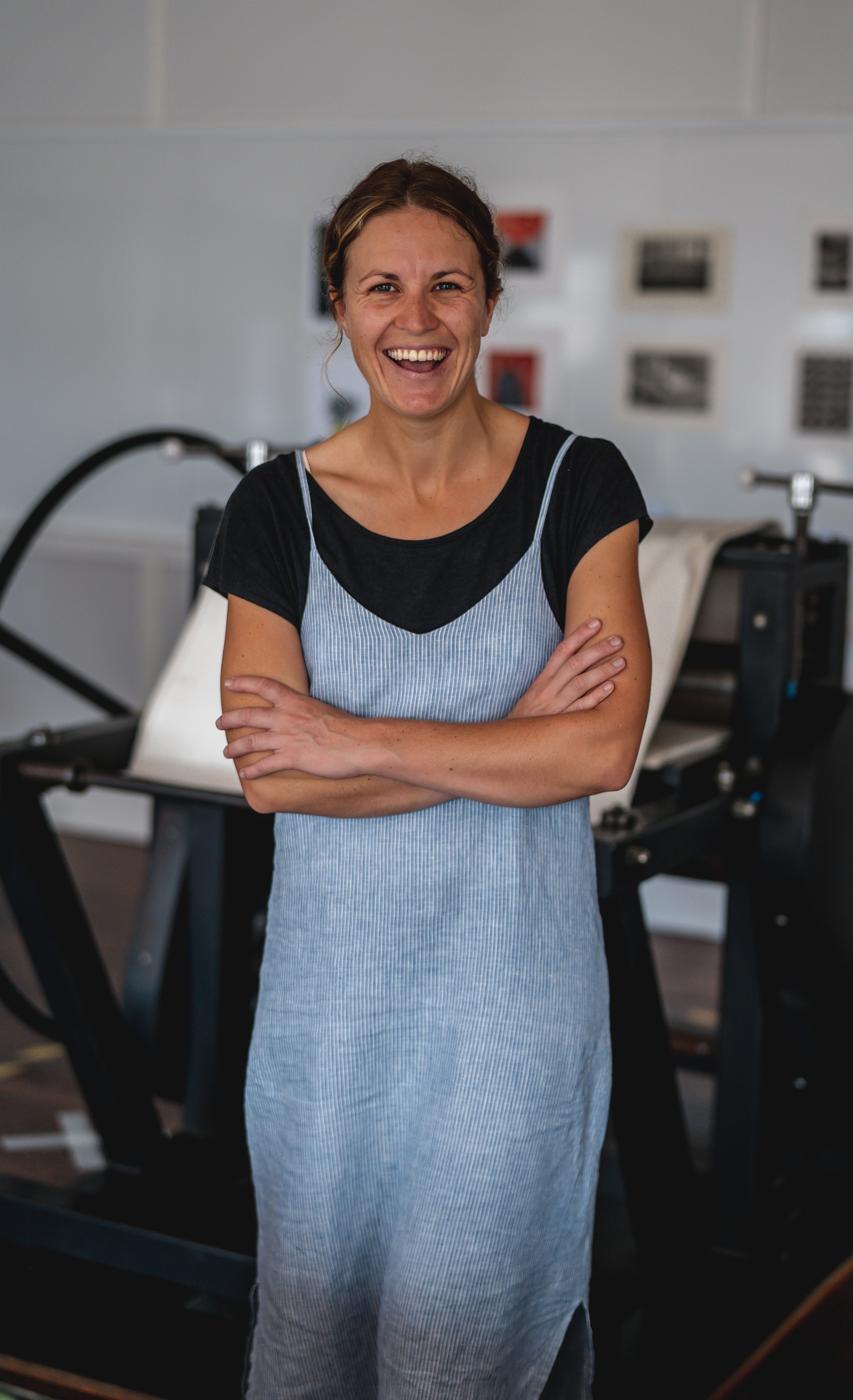
Nicole Pellow (b.1991) is a printmaker living and working on Awabakal country in Newcastle, Australia. She works across multiple methods of printmaking, primarily using silk-screen and solar etching plates to create her images. She embarked on a long hiatus after completing a bachelor of Visual Art at Southern Cross University to travel and focus on her teaching career, and has used 2021/22 to reinvigorate her artist practice by experimenting with style and technique. Pellow hosts screen-printing classes as an active member of the Newcastle Printmakers Studio, and has exhibited as part of group shows and individually across NSW.


Tell us about your creative process, what drives your practice?
My creative process comes in bursts. I hyper-focus on a technique or idea, and will adapt and push this idea until I have a body of work that I will then tire of and move on to the next. This has made it hard to develop my style and maintain a consistent art practice, however, I think I will stick with CMYK screen printing for a while. Artmaking is introspective for me, and while I have a website and attempt to market my art on my Instagram, the prints are a byproduct of a deeply personal and reflective process. I use art making and research to collect, inspect and make sense of my world.
Recently you have been archiving ephemeral moments such as cloud formations and light through glass. What is the significance of documenting these transient compositions in your work?
My latest exhibition, Subtract, was a collection of digitally altered images of clouds that were then printed using the CMYK technique. This body of work was developed from the solitary months in the 2021 lockdown. I spent many hours outside, sitting in the sun with my dog while I taught my online classes. I was enthralled by the transience of cloudscapes and how quickly they changed. The setting sun or a storm rolling in made the most beautiful formations that had to be captured in the moment. This developed into a process of always looking up, reflecting and appreciating how my subject could not be premeditated. The year-long obsession meant I would pull over if I was driving and zoom in to avoid the powerlines in my image, or drive to the top of a hill to capture the clouds along the horizon. The digital alteration of these images to include moon-like structures gave the body of work an ephemeral layer, that were then reproduced using the CMYK technique. I deliberately omitted the black layer to reduce the shadows and develop a vintage, polaroid saturation. I found the juxtaposition of looking up and being in awe of how small we are in the world with the modern urge to document everything curious. This body of work commented on the power of nature and the human desire for connection when the world was keeping us apart.
What is your attraction to screen printing, specifically CMYK techniques, as opposed to photography?
There’s something special about deconstructing and reconstructing an image. I love that an image can look like a photograph from a distance, but up close you can see the building blocks of its creation. The nuances that come from printing each layer are what make it unique. I think printmaking is going through an interesting time in history. It’s only relatively recently that prints have made accessing art accessible for everyone, but have changed the public perception of what printmaking actually is. It was only when my friends saw what I did in person that they realised it wasn’t just printing an image from a computer and that there was a lot more than went into it. I think I like my object to be defined and obvious, and CMYK leads itself to that.


Are there any female printmakers | artists that influence you?
I adore Em Jaxon of Lana Bagu’s lino printing. She works in reduction prints, which is appealing because it’s so different to my practice. Her bold colours and gothic/surreal figures look like they have such a story to tell. I feel the same way about Charlotte Alldis’ haunting figures in her paintings. Her playfulness and layering of colours is awe inspiring.
Finally, what exciting projects are you working on at the moment?
About a decade ago, I discovered the graphic design of David Carson and Ray Gun magazine. I loved the grunge, no-rules style of typography and design, and created a body of work around this. I never felt like this was truly completed, so I recently bought another magazine from a collector to kick start my research process and further explore this idea. I want to take these ideas and contrast them with the hyper-capitalist and consumerist, media saturated state of the modern world. My last body of work was aesthetic, and I want this next one to make a statement. Stylistically, I am using more block colours and balancing that with CMYK in small sections. I’m also in the middle of completing a series of all the boutique beers in Newcastle. This is a super fun project that I’m hoping to exhibit somewhere next year.